
この記事では、ReactのプロジェクトにMUIをインストールして、TexFieldの基本的な設定から使い方までを段階的に説明します。初心者でも分かるように、説明したいと思います!
 もちた
もちたTextFieldはMUIを使うのであれば、必ず使用するコンポーネントなので、是非使い方を学んでいってください!
目次
ステップ1: 環境設定
MUIとMUIに必要なライブラリをインストールします。
npm install @mui/material @emotion/react @emotion/styled @mui/styled-engine-sc styled-componentsステップ2: TextFieldの使用
以下のコンポーネントを作成し、App.tsxで呼び出してください。
import * as React from 'react';
import Box from '@mui/material/Box';
import TextField from '@mui/material/TextField';
export default function TextFieldTest() {
return (
<Box
mt={5}
component="form"
display='flex'
noValidate
autoComplete="off"
gap={3}
>
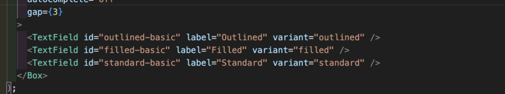
<TextField id="outlined-basic" label="Outlined" variant="outlined" />
<TextField id="filled-basic" label="Filled" variant="filled" />
<TextField id="standard-basic" label="Standard" variant="standard" />
</Box>
);
}import TextFieldTest from "./TextFieldTest";
export function App() {
return (
<div className="App">
<TextFieldTest />
</div>
);
}
export default App;
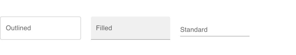
以下のような3パターンの入力項目が表示されます!
ステップ3: TextFieldのカスタマイズ
MUIのTextFieldのカスタマイズ方法について、いくつか説明します。
表示形式(valiant)
先ほどのコードにもある通り、valiantを設定することで、表示の形式を変えることができます。
値はoutlined filled standard の3つになります。
入力項目の基本的な設定(form props)
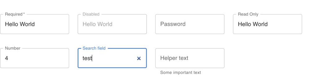
required:trueにすると、画面の通り、ラベルに「*」がつくようになります。デフォルトはfalseです。disabled:trueにすると、非活性状態になり、入力ができなくなります。デフォルトはfalseです。autoComplete:設定すると、オートコンプリート機能が使用できるようになります。defaultValue:値を設定すると、初期値が設定できます。readOnly:trueにすると、フォーカスは当たりますが、入力ができなくなります。helperText:値を設定すると、入力項目の下部に値が表示されます。
import * as React from "react";
import Box from "@mui/material/Box";
import TextField from "@mui/material/TextField";

export default function TextFieldTest() {
  return (
    <>
      <Box mt={5} component="form" display="flex" noValidate autoComplete="off" gap={3}>
        <TextField required id="outlined-required" label="Required" defaultValue="Hello World" />
        <TextField disabled id="outlined-disabled" label="Disabled" defaultValue="Hello World" />
        <TextField
          id="outlined-password-input"
          label="Password"
          type="password"
          autoComplete="current-password"
        />
        <TextField
          id="outlined-read-only-input"
          label="Read Only"
          defaultValue="Hello World"
          InputProps={{
            readOnly: true,
          }}
        />
      </Box>
      <Box mt={5} component="form" display="flex" noValidate autoComplete="off" gap={3}>
        <TextField
          id="outlined-number"
          label="Number"
          type="number"
          InputLabelProps={{
            shrink: true,
          }}
        />
        <TextField id="outlined-search" label="Search field" type="search" />
        <TextField
          id="outlined-helperText"
          label="Helper text"
          defaultValue="Default Value"
          helperText="Some important text"
        />
      </Box>
    </>
  );
}
入力チェック(validation)
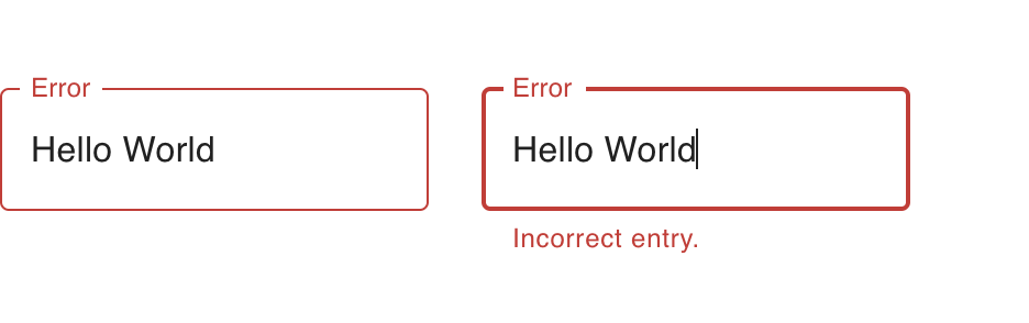
error のオプションを設定することで、入力項目の枠を赤色にすることができます。helperTextが設定されている場合、同様に赤色になります。
import * as React from "react";
import Box from "@mui/material/Box";
import TextField from "@mui/material/TextField";

export default function TextFieldTest() {
  return (
    <>
      <Box mt={5} component="form" display="flex" noValidate autoComplete="off" gap={3}>
        <TextField error id="outlined-error" label="Error" defaultValue="Hello World" />
        <TextField
          error
          id="outlined-error-helper-text"
          label="Error"
          defaultValue="Hello World"
          helperText="Incorrect entry."
        />
      </Box>
    </>
  );
}
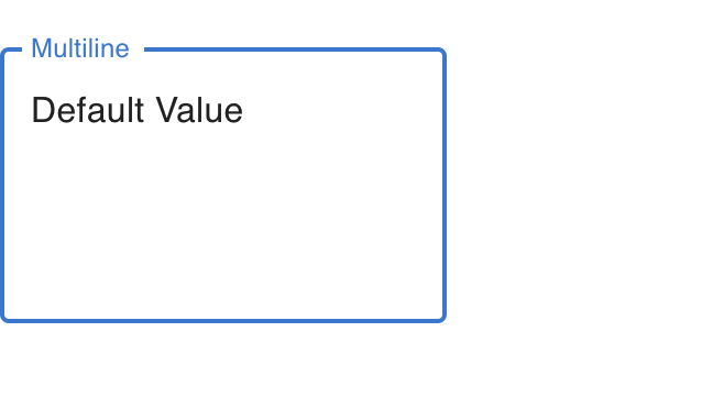
Textareaに変更(multiline)
multiline を設定するだけでtextareaに変更することができます。
import * as React from "react";
import Box from "@mui/material/Box";
import TextField from "@mui/material/TextField";

export default function TextFieldTest() {
  return (
    <>
      <Box mt={5} component="form" display="flex" noValidate autoComplete="off" gap={3}>
        <TextField
          id="outlined-multiline-static"
          label="Multiline"
          multiline
          rows={4}
          defaultValue="Default Value"
        />
      </Box>
    </>
  );
}
まとめ
MUIのTextfieldは、多くのスタイルオプションとプロパティが提供されており、入力項目を作るのに非常に便利です。
とてもおすすめなので、是非使ってみてください!
DataGridの使い方については、以下を参考にしてください。
React MUI DataGridの始め方と使い方、よく使う機能・設定について
